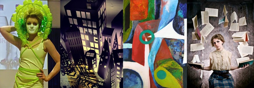
It has been exciting to see some of the relief work you have produced this week, both the grey card constructions and some of the drawing you have made based on these has been excellent. This work will look great in your portfolios in 12 months time.
The next challenge is moving fully into 3 dimensions to create a free standing sculpture. Obviously what you have learnt from creating the relief work will be vital, but there are a host of new things to consider as well. Here is a brief guide to a few of them:
BALANCE: The visual impression a sculpture gives to the viewer can be altered radically by how the piece is supported, pieces that are balanced on a few small points of contact with the ground tend to look more dynamic (for example the Eduardo Chillida piece below), whilst a sculpture with a large heavy base tends to give a much more stable, secure impression.
 |
| Eduardo Chillida |
TENSION: Related to balance, this can refer to visual tension created by the impression that a structure is unstable. It can also be a reference to physical tension created by construction techniques, for example in this piece by Naum Gabo where the interconnecting wires are tensioned between the more substantial elements:
 |
| Naum Gabo |
WEIGHT: This can refer to the physical weight of the sculpture (or elements of it), but more commonly would be used to describe the "visual weight" so a chunky solid volumes (see the David Smith piece below) would tend to have more weight than a delicate linear element such as the wires in the Naum Gabo sculpture (above).
SPACE: The elements of a sculpture interact with the space that surrounds them. Space is the unspoken part of any sculpture. Making interesting spaces between the elements of a sculpture is as important as the elements themselves. The way Deacon's open construction below allows your eye to move through the piece above is a good illustration of this.
 |
| Richard Deacon |
 |
| Alexander Calder |
 |
| David Smith |
 |
| Naum Gabo |
 |
| Anish Kapoor |
CONSTRUCTION: This is vital. Whether sculptures actually stand, connect, balance and stay intact is dependent on how effectively they are constructed. With your own work you will find that measuring, cutting neatly and utilising joining techniques such as slotting and interlocking should minimise the need for glue and help you towards the best possible work.
RHYTHM: In the same way that the abstract paintings we did in the first project had "Visual Rhythm" the same is true of 3 Dimensional Fine Art work. Directional elements can be used to lead the eye and repetition can create visual relationships. The steamed wood sculptures of Richard Deacon are a particularly good example of this.
 |
| Richard Deacon |
SCALE: How we relate to sculpture is heavily dictated by its scale. Our reaction to a delicate piece we could hold in our palm (such as Tim Hawkinson's bird made of nail clippings) will be very different to how we respond to a piece such as Anthony Gormley's towering "Angel of the North" which is set on a hill top looming over Newcastle.
 |
| Anthony Gormley - Angel of the North |
 |
| Tim Hawkinson |

No comments:
Post a Comment