Hi, hope you’ve been enjoying the Easter break. You should be putting the final touches to your “From Impressionism to the 21st Century” essays this weekend, so I thought I’d post my exhibition choices and a few of my reasons for selecting them to help you along. There are of course no wrong or right answers to this assignment, what is interesting is the thinking behind the choices you make. This post is not formatted as an essay, it is just to give you an insight into how to justify the selections you make.
For my 10 Artworks I have decided to go for 5 paintings and 5 other Artworks that cover disciplines such as collage, sculpture, installation and video. Thinking about how the show will work as a whole I have tended towards larger scale Artworks where scale is part of the “wow factor” they have for me. I have attempted to spread my choices across the time period being addressed, but there are gaps, which I guess come down to personal preference.
I think I would go with an approximately chronological format to my exhibition, so here are my choices:
Claude Monet, Rouen Cathedral Series 1892 – 1894
OK, this first one is a bit of a cheat, thirty for the price of one! Still I wanted something from the Impressionist period to kick the show off, and I thought if you collected together all Monet’s Rouen Cathedral works it would create an overall impact similar to some of the other works later in the exhibition.
Amongst Monet’s works this set of paintings is a personal favourite, I really appreciate the subtle changes in colour and light and the textural brushwork. Having seen several of them together at the Musee d’Orsay in Paris I know they complement each other well when seen as a group.
They are by the most significant painter of the Impressionist period and clearly demonstrate the fascination with light and observation that was so typical of this Art movement. The strong Architectural structure of the pieces also helps steer them away from the more sentimental subject matter that the Impressionists sometimes depicted.
Umberto Boccioni, Unique Forms of Continuity in Space 1913
The first choice from the twentieth century, and one that stands for a dynamic new age. The Arts developed rapidly between 1900 and 1920 with a succession of movements across Europe (Fauvism and Cubism in France, Expressionism in Germany, Constructivism in Russia and Futurism in Italy) and this piece from near the middle of the period represents that dramatic progress well. The Futurists were captivated by the age of the machine that was emerging around them and “Unique Forms” captures the confidence and energy of the time.
It is also a piece that has a graceful visual rhythm that appeals to me, and whilst it was a very modern work in its day it also employs traditional sculptural bronze casting technique.
Marcel Duchamp, Fountain 1917
The next exhibit only dates from four years later, but it abandons traditional sculptural technique altogether. It is not an aesthetically beautiful piece, but its importance is huge.
It was part of Duchamp’s “readymade” series and it was clearly his intention to provoke a reaction when he decided to exhibit a urinal adorned with a joke signature as a serious work of Art.
Duchamp was associated with the DaDa movement, a nonsense word the contributing Artists coined as an indication of their desire to break with tradition and frequently ridicule the world they inhabited.
The power of this work is apparent in the fact that it can still create fierce debate about its Artistic merit nearly 100 years later. This piece, more than any other, opened the doors for every Artist that followed: Duchamp had torn up the rulebook and given Artists a licence to experiment.
Pablo Picasso, Guernica 1937
Picasso was a child prodigy who developed into probably the most significant Artist of the twentieth century, so I feel he must be represented in the exhibition. His huge catalogue of work gives a multitude of potential choices, but for me it boiled down to a decision between two:
Les Demoiselles d’Avignon - a seminal work of his Cubist period from 1907; or Guernica - his politically charged response to events in the Spanish Civil war. In the end it was the scale of Guernica that swung it for me, this canvas would have guaranteed impact as viewers moved through the gallery.
The fragmented composition of broken bodies and the absence of colour are evidence of the anger that Picasso felt about events in his homeland. Passion was always evident in how Picasso approached both life and his Artistic practice and Guernica is perhaps the strongest example of him transferring this onto canvas.
Rene Magritte, The Empire of Lights 1950
This is a personal favourite, I just love the magical atmosphere that is created by the simple visual device of combining the street by night and the sky by day. Surrealism is an important twentieth century Art movement and I felt it should be accommodated in the exhibition, but I find many surrealistic works lack compositional rigour and the subject matter is often less than subtle, this image avoids those pitfalls.
The link between the emergence of psychology, the science of the mind, and the visual works of the surrealists is a fascinating one. In many surrealistic works the imagery runs riot - perhaps like some of the theories of the pioneers of psychology Freud and Jung, but in the Empire of Lights there is a clarity that I appreciate. The painting dates from fairly late in Magritte’s career and perhaps it is partly due to his maturity that he feels no compulsion to over complicate things.
It is a fairly large painting (nearly 2 metres in height) so I feel it would have the necessary scale to hold its own amongst my selections.

Jackson Pollock, Autumn Rhythm 1950
Energy and passion always appeal to me and Jackson Pollock had these qualities in abundance. There is a graceful power to the mark making, and I particularly enjoy the subtle colours in this piece. Compositionally Pollock’s best works (such as this) have great balance – a kind of ordered chaos.
Pollock was of course a revolutionary, departing from the painter’s long held territory of the brush and easel in favour of the floor and a turkey baster!
Although it dates from the same year as the Magritte painting I selected, it belongs to a completely different age – the birth of Abstract Expressionism rather than the last throes of Surrealism (a movement whose roots lie in the 1920s).
It is also the first non European Artwork in the exhibition and represents the increasing globalisation of developments in the visual Arts after the Second World War. Once more it is painting on an epic scale with the power to captivate an audience.
Robert Rauschenberg, Monogram 1955
Collage is one of the major innovations of twentieth century Art and Rauschenberg is one of the finest exponents of this approach. His work straddles movements, juxtaposing the modern imagery of Pop Art with the powerful mark making of the Abstract Expressionists.
In Monogram (part of his combines series) we are confronted by the powerful presence of the stuffed Angora goat complemented by the subtle colours of the collaged base. The sense of mysterious hidden meanings waiting to be decoded adds to the fascination of this piece.
Rauschenberg’s combines also challenge the artificial boundaries between the disciplines of painting and sculpture. The influence that Rauschenberg’s work continues to exert on contemporary practitioners is testament to the ongoing relevance of his work.
Joan Miro, Blue I, II & III 1961
I have chosen this triptych of works by the Spanish Artist Joan Miro on largely aesthetic grounds – having seen these paintings I know the wonderfully calming effect of being in their presence. Like the works of Mark Rothko there is a meditative quality in this series, but along with their spiritual air there is also a lightness, a sense of playfulness and humour that Rothko lacks.
It is not a remarkably radical work for the time it was created, but like the painting by Magritte it showcases the mature phase of an Artist’s career, a period when the confidence and courage to work outside the prevailing movements of the time often emerges.
Once more the scale of this piece is large enough to engulf the viewer in common with the works by Picasso and Pollock. A good painting should be like a favourite song – you look forward to the next chance to experience it, this triptych certainly fills that criteria for me.
Anthony Gormley, Field for the British Isles 1991
Installation has grown into one of the most important new media over the last 40 years. When done well, installation works can really provoke the “wow” reaction, Gormley’s collection of 40,000 terracotta figures certainly has this impact.
There is something quite humbling about being in the presence of this multitude of clay people each staring at you imploringly with their simple finger push depression eyes.
The echo of China’s ancient armies of Terracotta warriors that were unearthed in X’ian is of course intentional. Gormley’s piece was created in collaboration with the local community in St. Helens, and the fact that the collective work has many authors gives each figure a unique identity whilst simultaneously being a tiny component of the overall work.
It is the only work in my selection by a British Artist, but represents the prominence that the visual Arts in Britain have attained in the last 20 years with the patronage of the Saatchi brothers, the emergence of the Turner prize and the revolution in London’s gallery scene heralded by the opening of Tate Modern.

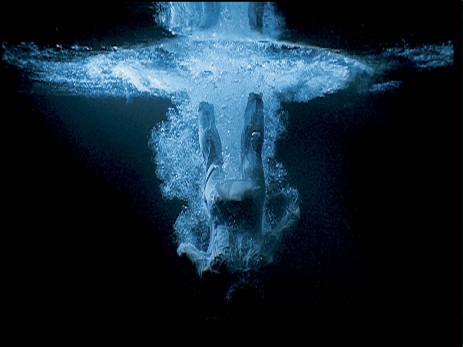
Bill Viola, Five Angels for the Millennium 2001
Alongside installation, video is another format that Artists have increasingly explored in the last 25 years. Most contemporary Art galleries today have plenty of examples of this genre, both good and bad.
One of the most skilful exponents of this medium is the American Bill Viola, whose slow motion pieces have a transcendental quality. Five Angels is a video work that is also an installation, as it comprises five large screens that are viewed simultaneously within a darkened space. In common with other works by Viola this piece refers to both religion (the ascending and falling angels) and personal memories (his near death experience as a child when he fell through ice on a frozen lake).
The overall impression is extraordinary, the video format allows Viola to engage more of our senses in experiencing the piece, the haunting sounds of the gurgling, bubbling, splashing water perfectly complement the stunning visuals. It is a powerful note on which to conclude the show.
OK, now the good news ...I don't want to be reading clumsily written and rushed essays, it is important for you, and far more pleasant for me if your essays are fantastic when you hand them in.
So, with this in mind I am extending the deadline to 4.30pm on Thursday to give you an additional couple of days to ensure your assignment is spot on. Remember it is highly likely that you will be taking this piece with you to University interviews next year as evidence of your analytical writing skills , so make it good!