ART BTEC Header

ART BTEC Header

Friday, 25 May 2018

Life Cycles Week 4/Half Term work.


You should have a series of images now for possible inclusion on your leaflet.  You need to make sure you have enough variety of imagery to enable you to make a good leaflet.  Aim to get up to date with all research and practical work – acetate collages, expressive type, all forms of printmaking, drawing etc.  The more the better as you will be also be asked to complete imagery on the leaflet to fill each of the 8 boxes on one panel with varying images to show:

1)     Abstract:  An image showing a section, portion or heavily cropped image that has been developed using paint\expressive mark making.

2)     Representational: An image taken from observation or a photograph that resembles an object or figure.

3)     Linear: An image using line only but can involve colour and surface additionally.

4)     Collage: An image using found materials newspapers, magazines, fabrics, metals etc.

5)     Pop Art: An image which uses symbols, signs and other well understood images within our culture i.e. male ♂ and female ♀ symbols, x and y chromosomes, kisses xxx, targets, +,  =  signs  → ?     £    $,  icons of popular culture, film stars, pop stars, images of consumerism e.g. packaging labels, advertising, domestic appliances.

6)     Photographic: This includes any of your location shots, studio set ups, black and white, colour, digital photography experiments with Polaroids.

7)     Photomontage:  Collage using photographic imagery cut and pasted together.  Humorous or satirical images e.g. Monty Python’s Meaning of Life.

8)      Text: An image made up entirely from layered text using provocative statements, information, famous sayings, a line from a poem, personal important diary entry dates etc.  Your message should be clear and emphatic and come from your life cycle.

IT IS VITAL YOU HAVE AT LEAST 15 STRONG VARIED IMAGES TO WORK FROM TO MAKE YOUR LEAFLET. There will a bit of time to add to your images produced so far but you are strongly advised to make sure you have completed everything to date well.
Look up https://handmadefont.com/ and pick 3 fonts that are expressive and inventive.


Show examples of inventive font within a moodboard and annotate why you are drawn to these.  Use these as inspiration to produce your own expressive messaging using found materials, objects at home i.e. the word death could be produced with soil, bones, twigs etc.
E.g. The word teenager could be made up from make up, clothes, graffiti, headphones, music, food etc.
Produce 3 expressive messages using varying materials and found objects. Photograph these and edit for printing in your sketchbooks.

Friday, 18 May 2018

Rooms for next week.

Due to the clearance of the main teaching studios for the exhibition next week your lessons will be re-located as follows:

ARD1-1           
 normally in room 855/861
AM
PM
MONDAY
522
No lesson
TUESDAY
522
No lesson
WEDNESDAY
No lesson
861
THURSDAY
861
522
FRIDAY
No lesson
861


ARD1-2           
 normally in room 815
AM
PM
MONDAY
No lesson
522
TUESDAY
861 Micro Lesson
No lesson
WEDNESDAY
No lesson
522
THURSDAY
813
No lesson
FRIDAY
522
522

Thursday, 17 May 2018

LIFE CYCLES Week 3


In terms of imagery you should be in the middle of producing:
             One sustained painterly piece.
             Monoprints and gold card prints.
             Mixed media collages – acetate collage and one other.

GRAPHIC DESIGNER RESEARCH
Before you start work on your own leaflet layouts you need to build your awareness of existing graphic design, you need to research 2 graphic designers - one historical and one contemporary.

HISTORICAL DESIGNERS:

Paul Rand

Alvin Lustig

Saul Bass

Milton Glaser

CONTEMPORARY DESIGNERS:

Eddie Opara

Stefan Sagmeister

Neasden Control Centre

Why Not? Associates


             Pick one piece of work from each and review how they communicate their ideas. 
             Briefly summarise their background, What are they best known for?
             Who have they worked for and how do they use imagery to communicate a message?
             How do they use Logos or posters to sum up and advertise a company?
             What visual language do they use to create an aesthetic language i.e. silhouettes, overlaid imagery, geometric forms, negative space etc.
             What is the purpose of this image? i.e. To advertise what exactly?  Please DO state the obvious!

PRACTICAL RESPONSE
             Work in the style of these with your photographs and produce 4 responses in all.
             Select 4 apt slogans to work with to relate to your life cycle and begin experimenting with techniques to enrich your work. 
             Develop a series of experimental positive or negative slogans to accompany your images for the leaflet.

Wednesday, 9 May 2018

LIFE CYCLES WEEK 2


PHOTOSHOOT NO 2:

Plan for another a photo-shoot that concentrates on a slightly different aspect of your theme . This could show objects as well as figures and use the location you have chosen in the best light.  Plan using storyboards showing extreme viewpoints - close ups, low angle, high angle, things in and out focus, shadows, lighting, action and movement.  
You will need at least 10-15 strong location images, you may need to take considerably more shots to achieve 10 good ones.  Try something different and consider the use of tripods, filters and wide angled, fish eye or macro lenses. 
As always make sure you print out wallet images of your unedited images and then larger prints of the edited ones that you feel are the most effective.
You  MUST annotate in your sketchbooks for unit 30 (Location Photography) so please do this as you go.  
Ensure you write about:
       Why you have chosen this particular  location?
·                  Composition
       Depth of field
       Contrast
       Texture
       Colour
       Sense of movement if appropriate
       Framing and Subject placement- how have you placed your subjects with reference to the light source  and location
       Lighting- spot lamp, soft, torch, natural.

LEAFLET RESEARCH

Find two examples of interesting leaflets and stick these into your sketchbook.
Answer the following:                                                   
       How is colour, text and image unified?  Comment on the layout, composition, or transition.
       Is there a regular position/scale/ for the text on the page?
       How is the type face integrated or contrasted with the other imagery?
       How is the front and back cover connected?
       How many images are used?
       What is the tone of the message? ie fun and feel good, shocking and serious etc
       Can you explain how marks , symbols and images have they been cleverly put together?

TECHNIQUE WORK/DRAWING:
Series of printmaking monoprints, and gold cards -  4 as a minimum using your photographs and other secondary images. Also some sustained drawing, we'll do some timed expressive ones in class.

Please have ready by next Wednesday 16th May  :
  • ·         10-15  photographs from  your second shoot with up to date annotation
  • ·         Leaflet research
  • ·         4 sustained  images from printmaking.
  • Sustained and expressive drawings.


Thursday, 3 May 2018

Life Cycles - WEEK 1 work


  • Word association mind-mapping for 2 life cycles across at least 2 pages (A3) or 4 pages (A4)
  • Visual mood boards  (gathered and collaged secondary imagery and text – use Pinterest and Google Image) for your chosen life cycle (2 pages A3, 4 pages A4).
  • Further more specific mind-mapping developing a personal theme/concept within your chosen Lifecycle (at least one further page of word association and one of imagery).
  • 2 Storyboards with plans for photoshoot, annotated to make clear what your intentions are with regards to location, models, props, make-up, costume, lighting, camera angle, depth of field etc. Plan a location relevant to your theme and make an effort to get strong images with considered composition, lighting, camera angles etc.
  • Analyse the work of photographers who use location in their work. 350 words each photographer, look at Robert Doisneau and one other, useful links detailed below.

Historical – Robert Doisneau documentary photographer  https://www.photographersgallery.com/by_artist.asp?id=201
Contemporary photojournalist  – Martin Parr http://www.martinparr.com/
Fashion photographer Emma Summerton http://www.emmasummerton.com/
Travel phtophotographer Steve McCurry http://stevemccurry.com/

ANSWER WHAT, WHEN, WHO, HOW, WHY.
·             Give examples of their work and then analyse this in depth using the questions below as starting points.

·            HOW DO THEY USE LOCATION WITHIN THEIR WORK?
·            Who are they and what kind of photography are they known for?
·             Give brief biographical background and tell us what work they have had published.
·            What ideas are they interested in?
·            What techniques or technology do these practitioners use to create interesting photographs? ie lenses. shutter speed, camera tripod, ie dark room black and white, digital, manipulation of this etc
·            What are they most known for, who have they worked for ?
·            How do they capture or utilise light, texture, movement of the place or moment images are taken?
·            Do they use candid shoots or are these planned?
·            Do they work with colour or monochrome?
·            How do they work with the model and the location?  What do they use to visually connect the two aspects together? 

  • A sustained piece of drawing from observation of objects/objects associated with your Life Cycle. 
  • One photoshoot on location using good light, props if necessary, styling and committed models completed by Tuesday 8th May.  
  • You will need at least 10-15 good shots to work with from this shoot, this usually means taking many more!

  • Wallet images of unedited images.
  • A few photographs edited to show your best images.
  • Annotations on how effective your images are.

Tuesday, 1 May 2018

BTEC 1st YEAR LIFE CYCLES – GENERATING IDEAS


BIRTH
PARENTHOOD
TODDLER
DIVORCE
TEENAGER                          
MIDLIFE CRISIS
LOVE
RETIREMENT
MARRIAGE        
DEATH

In your groups answer the following questions:
1.     What symbols and objects are associated with this life cycle?
2.     What locations are associated with this life cycle?
3.     Who are the range of people connected with this life cycle?
4.     What kinds of emotions would you think of in connection with this life cycle?
5.     List the positive and negative things associated with this life cycle
6.     What kind of body language and facial expressions do you think of with regard to this life cycle?
7.      What kinds of things do we say, or would you read in connection with this life cycle?
8.      List any famous phases, poems, song lyrics , slang, or famous sayings, rhymes etc
9.     How is this life cycle regarded in this country and in other cultures?
10.What famous celebrities past and present do we associate with this life cycle?
11.What changes in this life cycle have we seen in the past 50/60 years to present day? List all the different  eras regarding this life cycle

·        Once you have thought of an idea for a life cycle that you feel has potential, research it and see if you can find out more information to make it into a firm concept which holds lots of threads of ideas connected to this. Start producing 10 thumbnail sketches to communicate possible ideas for photo-shoots. 

Life Cycles Brief


                                                                                                                                                  BTEC ASSIGNMENT BRIEF                                                                                                           
Qualification
BTEC National Extended Diploma Art and Design

Unit number and title
Unit 45 Graphic Image Making
Unit 30 Location Photography
Learning aim(s)
For NCF only


Assignment title

Life Cycles
Assessor

Charmian Thomas/Gayle Bicknell
Hand out date

30th April 2018
Hand in deadline

2nd  July 2018
Vocational Scenario or context


The South Bank centre are having a pop up temporary exhibition with photographs and art work .  They have asked you to produce some visuals within a leaflet that promote  the idea of ‘Life Cycles’.  You are asked to  produce a 6 sided leaflet on 1 stage in life  Within the leaflet you will need to follow a grid format that will form part of your leaflet but apart from this theme can interpreted in any way you wish using photographs and mixed media.  You will use workshops within lessons to explore a wide variety of techniques and processes.

        Mindmapping - research, development of concepts, photography shoots, drawing, workshop techniques      
        Location Photography- research and  specific workshop techniques working from your photographs .
        Leaflet and Graphic design – research and development  producing  mock ups, and resolving the leaflet, evaluation.

Within this project you will experience the area of Graphic Design: how to mind map, develop slogans, captions and take these through to a concept. This project requires you use photography and create your own inventively manipulated imagery.  It encourages you to explore different visual language within Art & Design i.e. the difference between abstract figuration, collage and photomontage. 

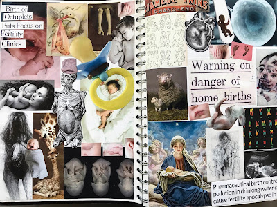
Here are some past students work for this project from both the final leaflets and from sketchbooks


Task 1


 WEEK 1


 LIFE CYCLES to choose from:

BIRTH
PARENTHOOD
TODDLER
DIVORCE
TEENAGER                                            
MARRIAGE                       
MIDLIFE CRISIS
LOVE  
DEATH
RETIREMENT

WEEK 1

1.       Produce a series of pages mindmapping for at least  2 of the  life cycles , working in small groups. P2

2.       Choose 1 life cycle to explore in as much depth as possible.  Produce 6 pages that explore your ideas in greater depth. This should include:  mind mapping, word association, mood boards, photographs, photocopies of objects, magazine cuttings, extracts from poems, slogans, observational drawings etc.  Write down everything to do with an idea not just a single word but everything to do with that theme:  e.g. marriage could be mind mapped in the following way:  - an American Las Vegas styled marriage.  P2

Mindmap: Las Vegas , the chapel of love, Elvis impersonator, side burns, 1 armed bandits, double your money, everyone a winner , poker, lots of tack gold, American flag, dollars signs, Stretch Limousine Cadillacs, wedding lyrics, four weddings and a funeral, white veil, Elvis white jumpsuit, renting a witness, best man, lady in waiting lyrics from songs about getting married, honeymoon suites, the film ‘Leaving Las Vegas’ and famous sayings from this.  All of these words could be visualised in varying imagery, textures, found objects and marks – make yours as exciting as possible!

 You will now have a definite ‘concept’.  A concept is a way into your life cycle that makes us think in a certain way.   i.e. different ways to get married to might  be :- a tacky wedding ceremony  in  Las Vegas, an extreme parachuting/ bungee jumping experience or  ‘my big fat gypsy wedding’ .

4) Analyse the work of 2 of the following photographers, Robert Doisneau and one other who use location in their work.  350 words each photographer

        A Historical documentary photographer- Robert Doisneau https://www.photographersgallery.com/by_artist.asp?id=201

        Contemporary photojournalist  – Martin Parr http://www.martinparr.com/:

        Fashion photographer Emma Summerton http://www.emmasummerton.com/

        Travel photophotographer Steve McCurry http://stevemccurry.com/


ANSWER WHAT, WHEN, WHO, HOW, WHY.
        Give examples of their work and then analyse this in depth using the questions below as starting points.
        HOW DO THEY USE LOCATIONS WITHIN THEIR WORK, ?
        Give brief biographical background and tell us what work they have had published.
        What ideas are they interested in?
        What techniques or technology do these practitioners use to create interesting photographs? i.e. lenses. shutter speed, camera tripod,  dark room black and white, digital, manipulation of this etc.
        What are they most known for, who have they worked for ?
        How do they capture or utilise light, texture, movement of the place or moment images are taken?
        Do they use candid shoots or are these planned?
        Do they work with colour or monochrome?
        How do they work with the model and the location?  What do they use to visually connect the two aspects together? P1, M1, D1

5)  Begin to generate ideas for a photo-shoot by producing  storyboards showing extreme viewpoints - close ups, low angle, high angle, things in and out focus, shadows, lighting, action and movement.  Make it achievable for yourself by using friends and family easily available in locations that you can return to if necessary.  Produce an in depth storyboard showing viewpoints, styling, ideal lighting, shadows etc  and include  how location is appropriate to this idea.P2,M3,
            
Produce at least 2 sets of strong photographic  shoots of 10 images using specific locations, considering light, props and camera angle.  Use cameras from photography and your own and consider the use of tripods, filters and wide angled, macro lenses.   P2,P3,,M2, D2,D3.

Print out wallet images of your unedited images and then edited ones that you feel are the most effective. P2,P3,,M2,M3, D2,D3.
Annotate  in your sketchbooks your use of :
        why you have chosen this particular  location?
·                   Composition
        Depth of field
        Contrast
        Texture
        Colour
        Sense of movement if appropriate
        Framing and Subject placement- how have you placed your subjects with reference to the light source  and location
        Lighting- spot lamp, soft, torch, natural


Checklist of evidence required

·         A minimum mindmapping pages for 2 lifecycles
·         6 pages of indepth moodboards, mindmaps, research on 1 life cycle
·         At least one detailed storyboard to show ideas for photographs on location with notes about lighting conditions, location and props, make up etc
·         Analysis of Doisneau, and one other photographer with questions answered
·         A set of 10-15 photographs taken on location
·         Wallet images of unedited images
·         A few photographs edited to show your best images
·         Annotations on how effective your images are with reference above in the task.


Criteria covered by this task:

Unit criteria reference
To achieve the criteria you must show that you are able to:
Unit 45           P2
develop ideas for graphic image making that relate to a given theme or assignment brief
Unit 30           P1
describe the characteristics of location photography
Unit 30
M1         
analyse the characteristics of location photography
Unit 30
D1
evaluate the characteristics of location photography
Unit 30           P2
use photographic technology, techniques and media to make photographs on location
Unit 30           P3
create location photographs that realise planned intentions
Unit 30           D2
use photographic technology, techniques and media to independently create location photographs that imaginatively realise planned intentions
Unit 30    
D3     
explain own location photography with considered reflection on the production process using correct technical language.


Task 2


WEEK 2/3/4 


Answer the following: P1,M1
        How is colour, text and image unified?  Comment on the layout, composition, or transition.
        Is there a regular position/scale/ for the text on the page?
        How is the type face integrated or contrasted with the other imagery?
        How is the front and back cover connected?
        How many images are used?
        What is the tone of the the message? ie fun and feel good, shocking and serious etc
        Can you explain how marks , symbols and images have they been cleverly put together?

4)       Research 2 graphic designers  one historical  and one contemporary P1,M1

        Choose from Saul Bass http://saulbass.tv/
   or Paul Rand http://www.paul-rand.com/  https://www.famouslogos.us/ibm-logo/
            and  ‘ Why not Associates’  http://whynotassociates.com/?in=selected

        Pick one piece of work from each and review how they communicate their ideas. 
      Briefly summarise their background, what are they best known for ?
        Who have they worked for and how do they use imagery to communicate a message?
        How do they use Logos or posters to sum up and advertise a company?
What visual language  do they use to create an  aesthetic language  ie silhouettes, overlayed imagery, geometric forms, negative space etc
        What is the purpose of this image? ie to advertise  what exactly?
 Please state the obvious 

5) Begin working from your photographs
in a variety of graphic image making ways using lots of mixed media.  Produce a whole range of exciting experimentation with image and text.   Produce 10-15 pages of combinations of the following:  P2,P3,M2

Try out :

        Printmaking - monoprints, gold card, letterpress           
        Computer manipulation
        sewing machine
        acetate collage
        spraypaint stencils
        collage
        image transfer with emulsion
        photomontage
        food colouring/ink and bleach
        pencil/biro drawing
        hand rendered slogans and sayings


Checklist of evidence required


·         Visual research and written analysis on leaflets
·         Analysis of a historical and contemporary Graphic designer Paul Rand or Saul Bass and Why Not Associates with questions answered.
·         10-15 pages of rigorous experimentation using a variety of graphic image making techniques and materials.


Criteria covered by this task:

See Below
Unit criteria reference
To achieve the criteria you must show that you are able to:
Unit 45
P1
identify the use of graphic image making
Unit 45
P2
develop ideas for graphic image making that relate to a given theme or assignment brief
Unit 45
P3
use media safely to produce graphic image outcomes
Unit 45
M2
demonstrate a considered approach to using graphic image making media in order to produce effective outcomes
Unit 45
D1
apply investigations to development and presentation of work,
evaluating techniques and processes to produce innovative graphic image outcomes.


Task 3


WEEK 5/6/7

6)       Select apt slogans to work with to relate to your life cycle and begin experimenting with techniques to enrich your work.   Begin to develop layouts, thumbnail sketches, using text along with image . Develop a series of positive or negative slogans to accompany your images.  Have a look at http://www.handmadefont.com/

Having developed your images begin to consider what would be an appropriate font and style you wish to use to visualise your life cycle in a leaflet format.  You are to include a grid for one of your panels within the leaflet. The size of your Leaflet should be 28 x 14cms.  Within each Leaflet you should produce 1 page that is equally divided into 8 sections [each section is 7 x 7cms] This can be on any of the sides. It could be that the Leaflet is unfolded to reveal a central page or be any other of the panels  Other panels can be developed as you wish but must look appropriate to the 8 grid section. M2,M3,P4,P2,

7).      For each of the boxes you should show a developed image using the following in any order:

Abstract:
An image showing a section, portion or heavily cropped image that has been developed using paint\expressive mark making.

Representational:
An image taken from observation or a photograph that resembles an object or figure.


Linear:
An image using line only but can involve colour and surface additionally.

Collage:
An image using found materials newspapers, magazines, fabrics, metals etc.

      Pop Art:
An image which uses symbols, signs and other well understood images within our culture i.e. male and female symbols, x and y chromosomes, kisses xxx, targets, +,  =  signs  ?     £    $,  icons of popular culture, film stars, pop stars, images of consumerism e.g. packaging labels, advertising, domestic appliances.

      Photographic:
This includes photogrames, location shots, studio set ups, black and white, colour, digital photography experiments with Polaroids.

      Photomontage:
Collage using photographic imagery cut and pasted together.  Humorous or satirical images e.g. Monty Python’s Meaning of Life.

      Text:
An image made up entirely from layered text using provocative statements, information, famous sayings, a line from a poem, personal important diary entry dates etc.  Your message should be clear and emphatic and come from your life cycle.


8)     Produce at least 2 mock-ups for your leaflet.  These should show different placement and ideas for the scanned in print outs showing sections, details, heavily cropped areas of interest etc. P3,M2,M3,

9)     Construct your leaflet by scanning in chosen images from your sketchbook and placing these within the leaflet format.  Be prepared to use photoshop to edit, merge and layer images so that your text and image work well within this format.  Create varying ideas and be prepared to be patient with your technology!

10)   Before you start printing, make sure you are completely happy with your outcome.  Let a tutor check finally  your rough colour print outs before you print finally.

11) Make sure you have annotated your sketchbook paying particular attention to your decision making regarding location photography and graphic image making within this project.


Evaluations for this project
 
You should answer questions in depth.  You should  use thumbnail sketches, diagrams or scanned imagery to make your points clearer. Evaluations should be a minimum of 500 words each word-processed and checked for spelling with images to make your points clear .

EVALUATION  GRAPHIC IMAGE MAKING  P4,M1,D1,

Pick 2 of your graphic images that you feel are important within your leaflet and evaluate them  in minimum of 800 words:

1.    Describe the two pieces, what techniques and decision making have you decided upon to  manipulate them and why they are effective for your theme and communicate the’ tone’ of your idea.  ie scratchy writing to suggest anger or teenage angst  or soft vintage filters on Photoshop to suggest time and marriage past.   How successful do you think these graphic effects are within your work  and  why?

2.   What symbols have you used within your graphic images on any parts of the leaflet or sketchbook?  Symbols are universally understood such as kisses, crosses, thumbs up, hearts, ying and yang, religious symbols etc

2.    How have you edited your images to fit the format of the leaflet, what  did you do to these?  Write in detail describing your efforts within Photoshop, Adobe Bridge, cropping, saturation, tone, contrast, brightness, clone tools  etc.

3.    Which designers or artists  have helped you to create a graphic style, and how can you describe the style you have adopted?  ie you could use words such as surreal, distressed, montage, chaotic, simplified etc


4.    What do you want the viewer to think when they see these images - a feeling for the moment, a sense of nostalgia, atmosphere, poignant reflection.

5.    How has text appeared on your leaflet?  What font have you chosen and what feel have you tried to communicate?

7.   Of the differing approaches to image making that you were asked to explore, which final images do you think are the most successful and why? Discuss each approach in turn.     Consider mentioning things such as formal elements, aesthetics, the use of tactile qualities, markmaking, simplicity, linear effects, layout, experimental use of media.
8.   How would you resolve, modify or change the final piece of work you have produced if you had a further 5 weeks of study. Do you think you have used your time wisely within this project?  How have you used lessons, private study times and have you stuck to the interim homework deadlines?


EVALUATION LOCATION PHOTOGRAPHY P1,P 4,M4,D3

1.    Explain what you understand by the term location photography, what kinds of photography do you  think this covers?

2.    What photographic equipment did you use to capture your photographs?  Please detail this and the settings you used on your camera/phone.?

3.   Who did you look at for this project and how did their work  impact upon your ideas?  Please be specific ie discuss elements of atmosphere, composition or concept that helped your work.

3.    How do your photographs relate to the location photographers you were asked to look at?

5.   Compare one of  your favourite own photographs on  location in relation to one of the photographer’s pieces.

6.   What kind of organisation of people and places have you had to do to arrange for your shoots to take place? Discuss your intention of location, composition, lighting, shutter speed, filters, and any other production techniques, use of dark room or digital, editing that you used to modify or enhance your image?

7.   Which 2 best photographs did you create on location and how did you produce these? If they were digital, can you discuss editing you did?.    What have you done to edit these  and what  programs have used to do this. ie Photoshop and Adobe Bridge, etc


Checklist of evidence required


·         Develop a series of positive or negative slogans to accompany images
·         A series of rough plans for the leaflet to try and work out how to express  ideas across the leaflet  in the most inventive way. 
·         Produce at least 2 mock-ups for your leaflet.  These should show different placement and ideas with similar imagery.

·         1 final leaflet based on your chosen life cycle

·         2 evaluations – one evaluating location photography and one summarising the graphic image making and whole  design process you have gone through . This should cover techniques, artist research, development and experimentation.

Criteria covered by this task:

See below
Unit criteria reference
To achieve the criteria you must show that you are able to:
Unit 30 P1
describe the characteristics of location photography
Unit 30 P4
review own location photography.
Unit 30 M1
analyse the characteristics of location photography
Unit 30
M4
discuss own location photography with considered reflection upon the production process.
Unit 30 D1

evaluate the characteristics of location photography
Unit 30 D3

explain own location photography with considered reflection on the production process using correct technical language.
Unit 45 P2
develop ideas for graphic image making that relate to a given theme or assignment brief
Unit 45 P3
use media safely to produce graphic image outcomes
Unit 45 P4
present own design outcomes against a given theme or assignment brief.
Unit 45 M1
describe the use of graphic image making and use to inform development of ideas for graphic image making to a given theme or assignment brief
Unit 45 M2
demonstrate a considered approach to using graphic image making media in order to produce effective outcomes
Unit 45 M3
coherently present final outcomes against a given theme or assignment brief.
Unit 45 D1
apply investigations to development and presentation of work,
evaluating techniques and processes to produce innovative graphic image outcomes.

Sources of information
to support you with this
Assignment


Attached to your outlook group files is the  Powerpoint slide show that you were originally shown.

·         See websites within this brief.


Books

·         The End of Print by David Carson and Lewis Blackwell

·         The Graphic Language of Neville Brody: v. 1

·         How to use graphic design to sell things, explain things, make things look better, make people laugh, make people cry, and (every once in a while) change the world by Michael Bierut.