ART BTEC Header

ART BTEC Header

Wednesday, 23 November 2016

OK, to ensure you are all crystal clear about what you should be doing over the next couple of days. What we want you to achieve is 4 beautiful responses to your 2 chosen illustrators using your own photos as the basis for these illustrations.
So you will need:
  • A collection of images by your 2 illustrators - enough to get a really good feel for their style, technique and media.
  • A range of photographs from the figure - try to get some good dynamic poses that have the feel of Fashion illustration/photography. If you are unsure what you are aiming for then flick through a few copies of Vogue and look at the fashion shoots and advertising images.
  • The appropriate media to respond to your illustrators, identify what they use and do likewise. If their work is produced digitally then don't try replicating it by hand.
Once you have all these things you need to really focus on making some impressive responses that capture the feel of each Artist. Use the lightbox to start your drawings from your own photos off if it helps. You might want to use software to extend and stretch the figures in your photos and achieve something closer to the classic fashion illustration proportions (which are quite different to the real proportions of the human body).

Here's an example of what I'm talking about:

Raw photo file

Digital Illustration by Jocelyn Gravot


Digitally developed response to Jocelyn Gravot

Fashion Illustration Work

You need to research the work of 2 fashion illustrators, here are a few good links to explore: 
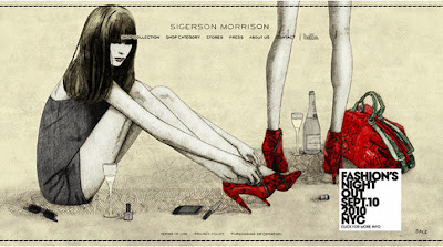


Anna Higgie
Try to choose illustrators that have contrasting approaches and use different media, as you are going to have to respond visually to these illustrators BE REALISTIC and select styles you are confident you can reproduce effectively. For each selected illustrator print out 3/4 reproductions of their work at a reasonable size (A5ish).
You then need to provide some analysis of each illustrator. Find out what you can about them - where they trained, who they have worked for. Most importantly analyse the images you have chosen, identify what media have been used and discuss technique (expressive or controlled?), composition, use of colour. Give your personal opinion on the work, but ensure you give reasons for the views you express.

Present the work thoughtfully (2 A3 pages per illustrator), think about layout and text/titles etc.


Developing your own illustration work involves a number of stages:
  • Do the Fashion Illustrator research as detailed above.
  • Take a range of dynamic photos from the figure. Using a studio environment for this will be advantageous (either book the photography spaces in the Stevens block or at least use the booth and lights in the Art Department). Look at Fashion shoots and advertisements to get ideas about suitable poses, enter into the spirit of it and avoid "wooden" poses.
  • Using your own photos as a basis produce two Fashion illustrations in the style of each Fashion Illustrator you have researched (4 images in all), make sure you use the most appropriate media. Take time over this and aim for some professional looking illustrations. See separate post for an example of this.
  • Using body templates we have distributed come up with a quick range of 6-8 design proposals for your garment (consider conversations you have had with your team when designing - e.g. if you have decided on theme colours or shapes then use them in your proposals).
Having produced some design proposals and hopefully gained some knowledge about Fashion illustration styles the next stage is to put these two things together:
  • In the last phase of the illustration you need to create a polished illustration of your final selected Design proposal. Again use your own photographs as the basis for this, but try to create a personal illustrative style. You might integrate elements of the techniques/media of the Artists you studied, but you should be aiming to take this final image further, and create something more personal.

This work should be completed to a high standard by Friday 2nd December so that you have a chance to concentrate on garment construction from Monday 5th December.

Thursday, 17 November 2016

Fashion Sketchbooks


So what should be going into your sketchbooks over the first week/10 days of this project?
Well, one reason behind using photography to record your Moodboards and not sticking everything down is that it means that the material you have gathered is then available for inclusion in your sketchbook.
So once you have got good photos of your Moodboards you need to divide (and potentially duplicate) the visual material amongst your design teams, and then compile the following:
  • 4 Sketchbook pages of visuals and information on your garment/accessory. Different versions - traditional and radical, history, definition.
  • 4 Sketchbook pages of visuals and information on the object you need to recycle. History, typical uses, unusual uses, previous applications in Fashion.
  • 2 Pages showing some examples of collections, ideally exploring some recycling, try looking at Martin Margiela and Jez Eaton for starters. Provide some analysis.
  • One or more good observational drawings from your object.
  • Printouts of all the slides from your presentation, plus copies of any cue cards you use.
After the Presentations are complete we will start to explore approaches to Fashion Illustration, responding to existing Illustrational styles, before trying to develop a more personal style with which to illustrate your own design proposals.

Fashion Presentation Schedule

All presentations to be given on Wednesday 23rd November, good luck! 

All group members should contribute to the delivery of the presentation in some way, so planning who will say what is a good idea. You will need to explain and expand upon the visuals you put up on screen (don’t just read text off the slide). Preparing and using cue cards is likely to be helpful. Presentations need to last approximately 10 minutes. 
Speak clearly (and not too fast), face your audience and most importantly practice your delivery as a group in advance. When you practice try timing your presentation to ensure it is of a suitable length.


UPSTAIRS GROUP 1
Time
Students
Object
9.05
Ella, Mollie
Clothes Hangers
9.20
Jessie, Diana
Disposable Cutlery
9.35
Amy, Trinity
Envelopes
9.50
Kieran, Lakshmi
Clothes Pegs
BREAK
10.25
Abby, Joel
Drinks Cans
10.40
Elise, Jaime
Plastic Cups
10.55
Maddie, Phoebe
Rubber Bands

DOWNSTAIRS GROUP 2
Time
Students
Object
9.05
Jordan, Josh
Disposable Cutlery
9.20
Abi, Harri
Clothes Hangers
9.35
Jaz, Holly, Emily
Envelopes
9.50
Issy M, Rhiannon
Clothes Pegs
BREAK
10.25
Beth, Izzy K
Plastic Cups
10.40
Hannah, Lily
Rubber Bands
10.55
George, Leah, Olivia
Cardboard Tubes
11.10
Jemima, Tom
Drinks Cans


Tuesday, 15 November 2016

Further Guidance on the content of your Presentation Slides

Before Wednesday you need to research both your object and your garment - collect and print enough material for compiling your A1 moodboards. Photos of these Moodboards will be the first 2 Slides in your PowerPoint/Prezi.
KEEP THIS STUFF LOOSE, DON'T STICK IT DOWN:
  • Lots of visual research into the garment you drew from the "cup", different versions/styles/shapes try to find inventive Haute Couture versions. Find 12 - 20 examples, print these images in a variety of sizes up to A4.
  • Plentiful visual research into the object you drew from the "cup" - different versions, different uses, unusual applications of your object, if you can find examples of it in Fashion then include these. Again 12 - 20 examples in a range of sizes.
  • Other stuff you need includes: headings and titles (use interesting fonts), dictionary definitions of your object and garment, photos of yourselves, as well as your own good drawings and photographs of your object.
For sourcing imagery try using  http://www.pinterest.com/ (open a free account if you don't already have one). Thoughtfully selected search terms in Pinterest will lead you to a host of rich imagery and ideas.
After Wednesday you need to concentrate on Slides 3 & 4. These are a little more demanding. 
  • For Slide 3 you will need to be imaginative in how you manipulate your object and record your experiments photographically. Explore processes like cutting, burning, laser cutting, heat pressing, appliqué, tearing, crushing, layering, stitching, riveting and photographing the object with a view to making a screen print.
  • For Slide 4 you will need to consult with all members of your Design team across the two groups to come up with some common themes for your collection (e.g. colours/particular ways of manipulating your object), after consultation you need to come up with some initial design ideas.  
  • For Slide 4 you will also need to find several examples of existing Collections and print 6 -10 images images of these . Most designers/design houses release themed collections seasonally, look for examples of collections that are inventive, exuberant and perhaps use elements of recycling - the work of Martin Margiela and Jez Eaton might be valuable starting points.
Times when both groups have lessons simultaneously (so the easiest times for consultation) are:
  • 8.50am - 10.05am Weds.
  • 10.25am - 11.25am Weds.
  • 2.00pm - 3.00pm Thurs.
Tips on Photographing Moodboards and preparing Images for Presentation

You have the option of preparing your presentation slides either digitally or through manual layouts that you record photographically and then convert into a digital format. If you are making manual Mood boards here are a few steps you can take to make sure that they look good as presentation slides.
The first of those are in taking the photographs - make sure they are well lit and that you position your camera above the centre of the image to avoid getting a taper distortion, take several photos to ensure you get images with a good sharp focus.
An example of "taper distortion"
Once you have got decent photographs it is usually possible to enhance them in PhotoShop before you transfer them into your presentation. Here is a raw photographic image followed by an edit of the same photo.


To achieve this I did the following:
  • Rotated the original image.
  • Cropped the image to remove unwanted areas.
  • Adjusted brightness and contrast to give the image more on-screen "zip".
  • Used the "sharpen more" filter to add crispness to the image.
  • Created a new layer, made a rectangular selection and filled this with a pale blue colour, then applied the multiply Layer style to this blue box.
  • Using the text tool added notes (in a font downloaded from www.dafont.com). I then used the move tool to place the text over the blue area.
  • Finally from the Layer Menu I added a drop shadow to my text from the Layer Style options.
Having done all this I then saved the final image as a jpeg (option available from the dropdown menu when you save in Photoshop). Using jpegs as presentation slides works fine, if you upload .psd PhotoShop documents or high resolution digital photos you may find they slow your presentation down and stop it functioning properly.

After you have arranged and photographed your moodboards share the loose imagery out between you and collage this into sketchbooks, giving due consideration to layout and combining text and image effectively.

Some of the Sculptural Work from the Alphasemble Project

Diana Silva

Abby Blakeley

Joel Molyneux

Madeleine Jay

Who is doing what?


STUDENT


OBJECT

GARMENT
Upstairs (GROUP 1)
Abby Blakeley
Drinks Cans
Jacket
Joel Molyneux
Drinks Cans
Dress
Elise Costain
Plastic Cups
Jewellery
Jaime Heath
Plastic Cups
Jewellery
Jessie Ford
Disposable Cutlery
Trousers
Diana Silva
Disposable Cutlery
Hat
Ella Francis
Coat Hangers
Shoes
Mollie Palmer
Coat Hangers
Jacket
Amy Gu
Envelopes
Skirt
Trinity Howard
Envelopes
Skirt
Madeleine Jay
Rubber Bands
Trousers
Phoebe Reynolds
Rubber Bands
Hat
Kieran Kemp
Clothes Pegs
Bag
Lakshmi Tran
Clothes Pegs
Shoes
George Finden
Cardboard Tubes
Dress
Downstairs (GROUP 2)
Leah Jackson
Cardboard Tubes
Dress
Olivia McLoughlin
Cardboard Tubes
Jacket
Jaz Bourne
Envelopes
Bag
Holly Holburn
Envelopes
Jewellery
Emily Luke
Envelopes
Jacket
Hannah Bocutt
Rubber Bands
Trousers
Lily Cush
Rubber Bands
Dress
Jordan Boorah
Disposable Cutlery
Bag
Josh Willis
Disposable Cutlery
Trousers
Jemima Farrow
Drinks Cans
Bag
Tom Malone
Drinks Cans
Skirt
Bethany Houghton
Plastic Cups
Hat
Izzy Killen
Plastic Cups
Jewellery
Abi McCanna
Clothes Hangers
Shoes
Harri Thomas-Martin
Clothes Hangers
Hat
Issy Mealey
Clothes Pegs
Skirt
Rhiannon Sumner
Clothes Pegs
Shoes