ART BTEC Header

ART BTEC Header

Thursday, 21 April 2016

Life Cycles - Graphics Project Brief


BTEC EXTENDED DIPLOMA IN ART & DESIGN 1ST YEAR
LIFE CYCLES - GRAPHIC DESIGN

Unit 45 Graphics Media, Techniques and Technology
Unit 30: Location Photography

RATIONALE
You will experience the area of Graphic Design: how to mindmap , develop slogans, captions and take these through to a concept. This project requires you use photography and create your own inventively manipulated imagery.  It encourages you to explore different visual language within Art & Design i.e. the difference between abstract figuration, collage and photomontage. 
 
TIME:     
 
4 weeks before half term
2 weeks study leave and 1 half term.
3.5 weeks after half term.
 
Project begins :
Wednesday 20th April – Friday  20th May  in existing base room.
Return 13th June normal timetable resumes :
DEADLINE:  Monday 13 June – Monday 4  July 3.5 weeks).
 
·         Life cycles project to be completed 2 summative units covered.
·         Visit to New Designers to be confirmed unit 5 summative unit
·         Personal statement, UCAS applications and holiday work- Design diary summative unit 5, set in last few days.
·         College breaks up Wednesday 6 July.
AIM:
 
On the theme of ‘life cycles’ produce a 6 sided leaflet on 1 stage in life .  Within the leaflet you will need to follow a grid format that will form part of your leaflet. You will use workshops within lessons to explore a wide variety of techniques and processes.
 
  •  4 weeks before study leave-  Mindmapping,  research, development of concepts, photography shoots, drawing, workshop techniques      
  • Study leave 3 weeks including half term  –  a  further location shoot , research and  specific workshop techniques working from your photographs .
  • On your return 13th June,-  developing producing mock ups, and resolving the leaflet, evaluation
Materials
 
·         printmaking - monoprints, gold card, letterpress                  
·         photography –  2 good shoots working within your theme, using dramatic lighting and extreme viewpoints.  You must use locations photography and studio based experimentation


·         sewing machine
·         acetate collage
·         spraypaint stencils
·         collage
·         image transfer with emulsion
·         photomontage
·         food colouring/ink and bleach
·         pencil/biro drawing
·         hand rendered slogans and sayings


LIFE CYCLES to choose from:
 
BIRTH
PARENTHOOD
TODDLER
DIVORCE
TEENAGER                    MIDLIFE CRISIS
LOVE                             RETIREMENT
MARRIAGE                    DEATH


PROCEDURE:  Week 1


1.    Produce at least 1 page of  initial brainstorming for at least  2 of the  life cycles


2.    Choose 1 to explore in as  much  depth as possible.  Produce 6 pages that explores your ideas . This should include:  mindmapping, word association, mood boards, photographs, photocopies of objects, magazine cuttings, extracts from poems, slogans, observational drawings etc.  Write down everything to do with an idea not just a single word but everything to do with that theme:  e.g. marriage could be mindmapped in the following way:  - an American Las Vegas styled marriage. 


Brainstorm: Las Vegas , the chapel of love, Elvis impersonator, side burns, 1 armed bandits, double your money, everyone a winner , poker, lots of tack gold, American flag, dollars signs, Stretch Limousine Cadillacs, wedding lyrics, four weddings and a funeral, white veil, Elvis white jumpsuit, renting a witness, best man, lady in waiting lyrics from songs about getting married, honeymoon suites, the film ‘Leaving Las Vegas’ and famous sayings from this.  All of these words could be visualised in varying imagery, textures, found objects and marks – make yours as exciting as possible!


3)   Come up with a definite ‘concept’.  A concept is a way into your life cycle that makes us think in a certain way.   i.e. different ways to get married to might  be :- a tacky wedding ceremony  in  Las Vegas, an extreme parachuting/ bungee jumping experience or  ‘my big fat gypsy wedding’ .


4)  Begin to generate ideas for a photo-shoot by producing  storyboards showing extreme viewpoints - close ups, low angle, high angle, things in and out focus, shadows, lighting, action and movement.  Make it achievable for yourself by using friends and family easily available in locations that you can return to if necessary.


5) Analyse the work of photographers who use location in their work.  350 words each photographer


ANSWER WHAT, WHEN, WHO, HOW, WHY.

·          Give examples of their work and then analyse this in depth using the questions below as starting points.

·         HOW DO THEY USE LOCATIONS WITHIN THEIR WORK?

·         Who are they and what kind of photography are they known for.

·          Give brief biographical background and tell us what work they have had published.

·         What ideas are they interested in?

·         What techniques or technology do these practitioners use to create interesting photographs? ie lenses. shutter speed, camera tripod, ie dark room black and white, digital, manipulation of this etc

·         What are they most known for, who have they worked for ?

·         How do they capture or utilise light, texture, movement of the place or moment images are taken?

·         Do they use candid shoots or are these planned?

·         Do they work with colour or monochrome?

·         How do they work with the model and the location?  What do they use to visually connect the two aspects together?


Print out wallet images of your unedited images and then edited ones that you feel are the most effective.

Annotate   in your sketchbooks your use of :

  • Composition
  • Depth of field
  • Contrast
  • Texture
  • Colour
  • Sense of movement if appropriate
  • Framing and Subject placement- how have you placed your subjects with reference to the light source  and location
  • Lighting- spot lamp, soft, torch, natural


4)     Produce at least 2 sets of  strong photo shoots of 10 images using specific locations, considering light, props and camera angle.. Translate these images in class and at home in  a variety of  ways.    


5)     Begin translating these images in a variety of hand rendered ways.  Produced a whole range of mixed media pieces to utilise within the leaflet. 


6)    Select apt slogans to work with to relate to your life cycle and begin experimenting with techniques to enrich your work.   Begin to develop layouts, thumbnail sketches, using text along with image . Develop positive or negative slogans to accompany your images.  Have a look at http://www.handmadefont.com/


7)    Make your own homemade font and photograph each letter separately using found objects or materials on white paper. Make it appropriate to your idea and use materials that are fitting to your theme ie an addiction theme for teenagers may be made up from cigarette butts but toddler might use toy cars and crayons. 


RESEARCH TO BE DONE OVER STUDY LEAVE


  1. Research 2 well designed leaflets.  Find examples of creative leaflets. Annotate and answer the following:


  • How does information flow from one panel to the next?
  • How is colour, text and image unified?  Comment on the layout
  • Is there a regular position/scale/ for the text on the page?
  • How is the type face integrated or contrasted with the other imagery?
  • How is the front and back cover connected?
  • How many images are used?
  • What is the tone of the the message? ie fun and feel good, shocking and serious etc
  • Can you explain how ideas and images have they been cleverly put together?


ARTISTS


Look at one artist or designer from each of the 8 lists.


Collect information on each and analyse their work.

 Answer the following questions:


  1. How have they composed their imagery?
  2. What media have they used?
  3. What processes and techniques have been included and what do you think about them?
  4. What mood, idea or concept does it reflect?
  5. Do you think the work is successful?  Why?
  6. What style would you say this work reflects?
  7. What makes this work interesting?       
  8.  Work in the style of 2 of these artists/designers and produce 4  images that reflect their work using some of your own photos.


ARTIST\DESIGNER REFERENCES. 
 
1.Abstract Imagery
     Jean Michal Basquiat, John Hoyland,
       Howard Hodgekin, Sean Scully,
       Franz Kline, De Kooning, Jackson
       Pollock
 
2.  Representational  Drawing
      David Hockney,
     Jenny Saville, Egon Schiele, THS,
Kelly Roper, Tim Tomkinson, David Foldvari
 
3.  Collage
     Kurt Schwitters, , Katy Lemay
     Eduardo Recife, Sara Fanelli
       Dawn Dupree, Tim Marrs, Alex
       Williamson
 
4.  Photography.
     Henri Cartier Bresson, Bill Brant, Bill Viola, Martin Parr,
Cindy Sherman, Corrine Day, Olivero Toscani,  Mario Testino, Nick Maplin, Robert Mapplethorpe
 
5.  Pop Art
    Richard Hamilton, Peter Blake,
    Jasper Johns, Robert Rauschenburg,     Andy Warhol, Roy Lichenstein
 
 
6. Linear Drawing
    Keith Haring, Michael Craig-Martin,
    Cy Twombly, Jasper Johns,
    Neasden Control Centre
 
7. Photomontage
    Eduardo Paolozzi, John Heartfield, Raoul Haussmann, Helen Chadwick, David Mach, Terry Gillam
 
8. Text
    Stefan Sagmeister,  David Carson, Fuel,
       Why Not Associates, Tomarto, Neville
      Brody, Barbra Krugar, Tom Hingston,
Designers Republic


N.B before Study Leave you will be expected to clear out your drawers and take all work home. by Friday 20 May  Be warned anything left in drawers will be thrown!


6.   Continue to develop ideas within workshop sessions.  You will need considerable amount of experimental ideas and imagery to make your leaflet.


7.   Having developed your images begin to consider the format. You are to include a grid for one of your panels within the leaflet. The size of your Leaflet should be 28 x 14cms.  Within each Leaflet you should produce 1 page that is equally divided into 8 sections [each section is 7 x 7cms] This can be on any of the sides.It could be that the Leaflet is unfolded to reveal a central page or be any other of the panels  Other panels can be developed as you wish but must look appropriate to the 8 grid section.


8.    For each of the boxes you should show a developed image using the following in any order:

·         Abstract:

An image showing a section, portion or heavily cropped image that has been developed using paint\expressive mark making.

·     Representational:

An image taken from observation or a photograph that resembles an object or figure.

·         Linear:

An image using line only but can involve colour and surface additionally.


·         Collage:

An image using found materials newspapers, magazines, fabrics, metals etc.


·         Pop Art:

An image which uses symbols, signs and other well understood images within our culture i.e. male ♂ and female ♀ symbols, x and y chromosomes, kisses xxx, targets, +,  =  signs  → ?  ♥   £  †  $,  icons of popular culture, film stars, pop stars, images of consumerism e.g. packaging labels, advertising, domestic appliances.


·         Photographic:

This includes photogrammes, location shots, studio set ups, black and white, colour, digital photography experiments with Polaroids.


·         Photomontage:

Collage using photographic imagery cut and pasted together.  Humorous or satirical images e.g. Monty Python’s Meaning of Life.


·         Text:

An image made up entirely from layered text using provocative statements, information, famous sayings, a line from a poem, personal important diary entry dates etc.  Your message should be clear and emphatic and come from your life cycle.


9.   Produce at least 2 mock-ups for your leaflet.  These should show scanned in print outs  showing sections, details, heavily cropped areas of interest etc.


10.      Before you start printing, make sure you are completely happy with your outcome.  Let a tutor see your rough colour print outs before you print finally.


MINIMUM SUBMISSION REQUIREMENTS


A full sketchbook.  The following should be inside:

§  1 page  each of mindmapping for  2 life cycles .

§  6 pages  on 1 life cycle in more depth-  mindmapping and mood boards,

§   8 pages of research on artists’ work with annotations and questions answered by the side

§  6 responses to 2 of these artists

§  2 leaflets with  research answering questions.

§  25 pages of research, development and resolvement on your chosen life cycle. These pages should show logical development and differing ways of presenting layouts for your leaflets - i.e. mock ups, varying images together, differing captions etc.  This sketchbook should be highly annotated

§  1 final leaflet based on your chosen life cycle

§  2 evaluations – one evaluating  location photography  and one summerising the whole  design process unit 45.  This should cover techniques, artist research, development and experimentation


You should answer questions in depth.  You must use thumbnail sketches, diagrams or scanned imagery to make your points clearer. Evaluation should be a minimum of 800 words long, word-processed and checked for spelling.


EVALUATION UNIT 45 GRAPHIC IMAGE MAKING

  1. Pick 2 of your graphic images that you feel are important within your leaflet  and evaluate them  in minimum of 800 words:
  2. Answer the following:
  3. Describe the two pieces,  why you think these are the most successful and how have you included these graphic images within the design of your  leaflet?  ie you  could have translated a photographic image into a tonal drawing and combined this with collage to make a contemporary feel that expresses something about your lifecycle. Describe indepth what you have done to create your graphic images and show images to explain your actions. 
  4. What symbols have you used within your graphic images on any parts of the leaflet or within the earlier parts of the sketchbook  and what do you want your leaflet to express?
  5. Discuss the development of your ideas within this project and the place of brainstorming, mood boards, diagrams, cutting up magazines or using found imagery within your graphic images you created.  How did your ideas develop in varying ways?
  6. What graphic techniques have you used to create  a certain ‘tone’ within your work and why is this relevant to your theme? ie scratchy writing to suggest anger or teenage angst  or soft vintage filters on photoshop to suggest time and marriage past.   How successful do you think these graphic effects are within your work , why?
  7. How have you edited your images to fit the format  of the leaflet What  did you do to these?  Write in detail describing your editing within photoshop, cropping, saturation, tone, contrast, brightness, clone tools  etc.
  8. Which designers have helped you to create a graphic style,  and how can you describe the style you have adopted?  ie you could use words such as surreal, distressed, montage, chaotic, simplified etc

9.    What message does this leaflet make about your life cycle?    What do you want the viewer to think when they see these images - a feeling for the moment, a sense of nostalgia, atmosphere, poignant reflection.


10. How has text appeared on your leaflet?  What font have you chosen and what feel have you tried to communicate?


11. Of the differing approaches to image making that you were asked to explore, which final images do you think are the most successful and why? Discuss each approach in turn.     Consider mentioning things such as formal elements, aesthetics, the use of tactile qualities, markmaking, simplicity, linear effects, layout, experimental use of media.


12. How would you resolve, modify or change the final piece of work you have produced if you had a further 5 weeks of study. Do you think you have used your time wisely within this project?  How have you used lessons, private study times and have you stuck to the interim homework deadlines?


EVALUATION UNIT 30 LOCATION PHOTOGRAPHY


1.    Explain what you understand by the term location photography, what do kinds of photography do you  think this covers?

2.    What photographic equipment did you use to capture your photographs?  Please detail this and the settings you used on your camera/phone.?

3.     Who did you look at for this project and how did their work impact upon your ideas?  Please be specific ie discuss elements of atmosphere, composition or concept that helped your work. How do your photographs relate to 3 location photographer’s work? Please compare your own use of location photography in contrast to  practitioners’ work  such as intention, composition, lighting, shutter speed, filters, and any other  production techniques, use of dark room or digital etc

4.    What kind of organisation  of people and places have you had to do to arrange for  your shoots to  take place?


5.    Which 3 best photographs did you create on location and how did you produce these? If they were digital, can you discuss editing you did .  If they were produced in the dark room please discuss the production of these with reference to how you did it.   What have you done to edit these including programs you have used to do this. ie photoshop and Adobe bridge, use of hard drives and memory sticks, google drive etc


Thinking Ahead - Choosing your Specialist Area


Main Specialist Areas

Fine Art

Fashion

Textiles

Three Dimensional Design

Graphics

Illustration

Animation

Film and Photography

Each of the above areas is an umbrella term for a variety of sub-specialisations that can be found within these disciplines.


Fine Art

Fine Art course cover painting, sculpture, printmaking, photography and film.  Most courses are modular and follow a fairly diagnostic first year, where differing areas are experienced with the intentions of specialising within the second year.  There are still a few which require you to opt beforehand. 

If you intend to follow Fine Art you need to be very self motivated, have good drawing skills, and be a person that is interested in ideas.  All courses will expect you to have your own visual language and body of work that is more or less self motivated.  Don’t consider Fine Art if you thrive upon other people’s starting points.  Colleges will expect you to work unaided for a lot of the time.  Good Fine Art courses are competitive.  Some like Goldsmiths and Central St Martin’s like particular sorts of students.  Goldsmiths for instance prefer mature, highly intellectual, independent and conceptual workers.  If you like painting landscapes in a fairly traditional way don’t consider the above course.  Make sure you view the college to check your suitability.


Fashion

This field covers designing, making, technical and business aspects.  It essentially trains you to design a collection for industry, however it does have many spin off career paths such as a buyer and image consultant, and numerous fashion management positions.  You may become an in house designer where you work with a team of designers under a particular label such as Gucci or freelance designer who sets up their own label. 

Many courses cover pattern cutting, fashion drawing, all manner of fabric production and technique.  They deal with business management and preparing you for employment.  This can be a large or small part depending upon the College.  Some courses require you to learn a language and want Maths, Language and English GCSE as part of the entry requirements.

Fashion is competitive.  To work within it you need to be a person who keeps abreast of current design changes both contemporary and historical and who enjoys designing for the body.  You will need good like drawing skills, the ability to draw quickly and must be able to work under pressure with a range of differing personalities.


Textiles

This area covers a broad subject area which breaks down into numerous sub-headings.  There are a diverse range of courses such as those that specialise in print, knitwear and weave, surface.  To do textiles you need to love ‘change’ trends and keeping abreast of design and art styles.  You need to be good at working with colour and a range of materials but also need an excellent drawing base and be a versatile worker.  You need to love surface manipulation.

 To do this subject area you need to be a person who loves experimenting with colour, fabrics, texture and manipulation of colour. You may be producing sample designs, liaising with clients, interpreting clients ideas, assessing production standards,  be an in house-designer or working freelance.

Career pathways may be postgraduate study, buyer and merchandising, retail sales and markets, fashion journalist, management. etc there are courses that combine fashion and textiles and those that let you work diagnostically during the first year and then choose within the second to specialise.


Three Dimensional Design

This covers a wide range of design specialisations:

Furniture                       Theatre and Costume Design

Product Design             Ceramics

Jewellery                      Industrial

Interior                         Glass

Architecture                  Automotive

Craft

 This area is extremely far ranging and can only be mentioned in fairly general terms here.  In most courses students learn about the design process as well as studying design history.  Many courses have good links with industry although they vary considerably in what they offer and how courses are structured.  Some courses endorse working in expressive sculptural ways, others put more emphasis upon function and commercial usage.  Manufacturing Technology, ergonomics and material use are all areas that courses cover.  Look carefully at the costs of some courses as these may be expensive according to specialisms.  metals and jewellery, for instance, incur a fairly expensive sub. 

 To work within three dimensional design you need to have a good aptitude for constructing and perceiving in three dimensions.  You should have the ability to work with a variety of materials and be able to communicate your ideas well.  Good problem solving skills, accuracy and attention to detail area all desirable.  


Graphic Design

This is essentially coming up with ideas, big ideas which lead to ‘concepts’ and ultimately can head a campaign to advertise a product, event or idea.  It isn’t just about working with text and image and liking layout in fact this is a minor part of this discipline the important part of this subject area is ‘lateral thinking’ and the number of ideas that it is possible to generate.    Courses will cover branding and logos, animation, photography, typography, concept development.

You need to be a dynamic thinker, versatile worker and enjoy working to deadlines. You will also need a  knowledge of trends, fashion, and contemporary design. it is useful although not essential to have some skills within CAD.  Courses will train you when you arrive.  Some  Graphic courses will encourage links with industry or give you opportunities to enter competitions then it is a good sign.

Career pathways may be:

Web design

Advertising

Marketing

Video Gaming

Exhibition design

Magazine design

Film and video design


Illustration

Illustration is drawing with a purpose. This means it is a design field that always works to a brief.  Illustration isn’t just drawing and painting for children’s books.  It may cover this but also considers packaging, advertising, narrative, sequential, concept art, gaming design, information leaflets and editorial works.  Courses will tend to want good skills within drawing and painting and people that can explore and develop their own style.  Some courses will cover CAD and digital imaging.  You need to be a person that loves drawing,  can come up with loads of ideas and interpret others’ text or idea inventively.  You also need to be able to solve/ produce imagery to deadline. Illustration falls into 3 main headings:

Narrative – books, fiction, non fiction, magazines, lyrics,

Promotional- any product, event, person to be promoted from trainers - breakfast cereals - live music.

Informational – anything that passes on information to others about a place, cause, conditions, tourism to a guide to making cup-cakes.

Drawing skills need to be good; you need to willing to work to others’ starting points and ideas.  Related fields are animation and graphics.  You should expect to be able to work quickly. A few graphic and illustration courses are combined.  Look for more expressive courses if you want to broaden your approach.

Animation

Animation can be drawn, imaginative three dimensional models, storyboarding and film.  It covers cinematography, traditional and contemporary methods of working as well as the latest innovations in electronic animation.

To follow animation you need to have good drawing skills, an ability to think sequentially and to convert your thoughts to the camera.  It is a very specialised area which is very competitive.  To go into this field you need to have a strong interest and knowledge of contemporary animation.  Good storyboarding skills and preferably evidence within your folio that you have an aptitude to work within this industry.


Photography and Film

Courses within these areas vary enormously. Some are directed towards graphics, advertising or journalism and concentrate upon the commercial side.  Photography courses break down into the following:

Fashion and Advertising

Commercial Photography

Journalism and Editorial

Others are Fine Art based and are much more expressive.  Some courses combine practical skill with Art and Design history and professional practice.

You need a good eye for composition, experience of SLR cameras and darkroom processes and for film, and an ability to think sequentially.  An interest in photographers and film makers is a must and a flair for leadership and organisational skills is desirable.

Some courses have a mixture of the two areas, others are completely separate.  Most students choose one or the other as in themselves they are diverse areas.

Film courses are often based on television studies, media and film making.  Students are required to have excellent storyboarding skills, ability to think about time, soundtracks and sequential imaging.   You will learn about digital and technical working and be trained in the use of editing.  You will be expected to work in a team and lead others within the direction of your vision and ideas.  You need to be an excellent communicator.

Thursday, 14 April 2016

Illustration Project: Evaluation Guidance and Submission Requirements List.


“ILLUSTRATION DAHLING”
PROJECT EVALUATION
To accompany your project submission you need to complete a word processed evaluation of at least 500 words, illustrating your evaluation with photographs is helpful. Discuss anything you feel was relevant to your work in the project, but ensure you cover the following areas:
Starting out:
·        What Roald Dahl story did you choose to work with? What appealed about this particular narrative, which images and scenes captured your imagination?
·        Who did you look at in your initial research (into storyboarding and existing responses to Dahl’s work), did these responses appeal to you and help you to develop ideas for your own photoshoot?
·        How successful were your storyboards? Did they allow you to compose shots to photograph, make you aware of potential problems, help you to identify the locations/props/models you would need?
Your Photoshoots:
·        Describe how you went about your photoshoots. What lengths did you go to in order to source props/models/locations/make up.
·        In your photoshoots how did you employ lighting, camera angle, composition, gesture and expression to achieve dramatic results.
·        Do you feel your photoshoots were successful? Are there any aspects of your shoots you would do differently if you had the chance to do it again?
·        Which photographer/s work did you research? Did their work appeal to you? Explain why you liked or disliked their imagery. Was this research helpful in terms of how to approach this part of the project? If the Photographers influenced you in any way explain what that was.
Drawing and Printing:
·        What drawing techniques did you employ when responding to your photos, do you consider your drawings successful?
·        Which Illustrators who focus on drawing did you research? Did their work appeal to you or help you with your own images, how?
·        How successful were your prints, are there ways in which you could achieve even better prints in future?
Mixed Media and Photoshop:
·        What techniques and imagery did you use in your collaged illustrations? Do you feel your mixed media images were successful?
·        Which Illustrators who use a mixed media approach did you research? Did their work appeal to you or help you with your own images, how?
·        Did you develop your work through PhotoShop? Did you integrate text into your work in any way? Are you pleased with your PhotoShop images, why?
Your Final Book:

·        How did you select imagery for your final board? Did you need to produce imagery specifically for the book or adjust existing images?
·        Describe how you chose to lay out your final book. Talk about the way in which you decided to include text, and how you feel this complemented your illustrations.
·        Did you encounter any problems resolving your book? How did you overcome these challenges?
·        Having looked at the online preview are you pleased with your project outcome? If you were to do it again what changes would you be tempted to make?
The Project:
·        How do you feel you managed your time throughout the project, did you push yourself?
·        Identify two skills you have acquired or improved upon during this project.
·        Identify two areas you could improve upon in future projects.

Include a printed version of your evaluation in your sketchbook and submit with the rest of your work.


Submission Requirements:

  • Research into Roald Dahl (1 page is fine)
  • Research into Quentin Blake's illustrations for Dahl's books, include reproductions of his work, background information, analysis of his style and at least one visual response. (2 pages)
  • Research into 2 films inspired by the works of Roald Dahl, some background information, justified personal opinion and images from the films (1 page for each film).
  • At least 3 pages of storyboarding for your photoshoot, this should be a mix of quick sketches and annotation. Sketches should explore potential compositions for photos; annotation should include quotes from the book that you are illustrating and lists of requirements (models, postures, expressions, locations, props, costume, make up, lighting etc.).
  • 1 or more pages showing some good examples of existing storyboards, with brief analysis.
  • Contact sheets of prints from your photoshoot.
  • Larger prints (A4/A5) of a range of your best shots.
  • Research into one narrative photographer with fantastical elements - e.g. Annie Liebovitz, Ruven Afanador, Viona Ielegems, Tim Walker. 2 pages with imagery, background and some of your own analysis of a couple of specific shots, consider what practical steps went into creating the image we see. So discuss location, models, postures, costume, props, make up, composition, lighting, camera angle, post-production.
  • At least 2 sustained full page careful observational drawings from your photographs, use different media for each of these - e.g. one tonal image in pencil, and one piece in biro. Fine liners or coloured pencils might be other media to consider using for these controlled pieces.
  • 4 or more quick expressive drawings.
  • Research into 2 narrative illustrators, these MUST be one historical and one contemporary practitioner. In this research it is important to give background biographical information on each illustrator, analyse some specific images in terms of content, technique and media and justify your own opinions on the work. You also need to compare the illustrators from different eras and describe how you feel illustration has changed over time. This research is set to meet the requirements of the Narrative Illustration Unit, so MUST be done well.
  • Using your own photographs as inspiration produce 2 interpretations of your images in the style of each illustrator you have researched - that is 4 illustrations in total. Take time over these and do your best to really replicate the style and use appropriate media.
  • A second photoshoot (ideally if your first was in the studio then this should be done on location). Injecting your project with fresh imagery is key to achieving a good final book.
  • 2 Gold Card plates cut with a range of prints taken from them, one of these should be an ambitiously scaled piece (A3).
  • 2 or more good pieces of monoprinting.
  • A few selective colour/invert experiments on the copier from either your drawings or prints.
  • 4 well resolved mixed media Collage images integrating the best of your drawing and printing along with other elements and text.
  • Ideally you should also complete some Photoshop developments from your Collage images.
  • Research into a Collage based illustrator.
  • Your word processed evaluation (see above).
  • & obviously as soon as it arrives, YOUR FINAL BOOK.

  • Illustration Project Final Book Advice and Deadline.

    You should now be at the stage where you are ready to upload your selected images (12 - 24) to an online publishing service such as Snapfish www.snapfish.co.uk or Blurb www.blurb.co.uk, prices for a 20 page standard size (20 x 25cm or A4) with softcover should be in the region of £12 - £15.
    The websites for these publishers have clear instructional videos on how to upload and arrange your imagery.
    Obviously this is a narrative illustration project, so having relevant text from the book either integrated into your illustration, thoughtfully positioned alongside or placed on the page opposite is a requirement.
    The inclusion of text needs careful consideration, you have a number of options, make sure you choose the best one to complement your illustrations:
    • Using text options from the online publication website (limited in terms of available fonts and placement options).
    • Collaging text by hand directly onto images before scanning (Flexible, but needs sensitivity so as not to interfere with the effectiveness of your images - a sensitive piece of drawing could be swamped by inappropriately chosen text slapped on top). Fonts (either hand created or sourced from magazines or websites like www.dafont.com) need to be carefully selected.
    • Scanning your illustration and then adding text through Photoshop (best done on a computer where you can upload fonts as typesets within Photoshop are limited).
      Be creative with your text...
    • Producing separate text (using direct quotations from the original story) to be uploaded as separate image files to be used on the facing pages to your illustrations. You can do this using downloadable fonts, by hand, through collage etc. This is probably the most flexible choice if you are keeping text and your images apart.
    Everyone should select, scan, adjust and upload  all imagery/text pages and order their books by the end of Tuesday 19th April.


    Remember that many of the illustrations you upload will benefit from some editing to ensure they have maximum impact in your final book; simple tweaks from the Image Adjustments menu in Photoshop can be highly effective, Contrast and Brightness are worth altering for almost all scanned images.


    We will be delivering the briefing for the new GRAPHICS project next Wednesday 20th April and you will have new work for that project from that point onwards.


    The FINAL DEADLINE for completed sketchbooks for this project is Monday 25th April. If your final books have not reached you by that date then you can submit those afterwards.


    Thursday, 24 March 2016

    Illustration and Essay Update

    So you have survived two terms at Alton College - Congratulations! Early next term we have some important deadlines as we start to address the Course Units.


    "From Impressionism to the 21st Century" Essay:
    This should be submitted on the first day back. Thanks to all of you who have sent me your choices of Artworks, those stragglers who I yet to hear from please get your act together - I can only help and advise you if you communicate with me!
    There is quite a lot of structured advice on how to write the essay in the assignment brief and the checklist - use these closely when you set about the writing. It is particularly important to ensure that your introduction and conclusion are well composed and thoughtful passages - when you go to HE interviews snippets from these sections are likely to be what is read. You may find it easiest to start by writing about some of your selections, then address the introduction and conclusion when you have gained a deeper understanding of the individual works in your exhibition.
    You will need to bind your assignment at the LRC on the Monday when we return (approx. 80p for a card back/acetate front & comb binder).


    Illustration Project
    We are not setting additional work for illustration over Easter, as we want the essay to be your main focus. When you get back we will have 2 weeks to select images, scan and upload to an online book printing service.
    As has been mentioned this week you should look at one Collage based illustrator to support the mixed media work we have been doing - make sure this is someone different to those you researched in the Architecture project. Some you might consider are Mario Wagner, Nazario Graziano, Tim Marrs, Martin O'Neill, Eduardo Recife or Mark Powell.


    Eduardo Recife

    Mark Powell
     In terms of the content of your final book as a minimum you will need to select the following from your project:
    •  2 Photographic images (edited).
    • 2 Expressive pieces of drawing.
    • 2 Sustained pieces of drawing.
    • 2 Images created as responses to Illustrators.
    • 2 pieces of printmaking.
    • 2 pieces of mixed media collage.
    All these images will need to be thoughtfully positioned alongside text from the original work by Roald Dahl that you are depicting, look at some picture books to see how text can be imaginatively incorporated, works by Oliver Jeffers, Dave McKean and Chris Haughton are particularly valuable sources.


    Oliver Jeffers
    If you have more than 12 strong images that you want to include in your final book that is fine, although keep it to a maximum of 24.


    An overall progress checklist for Illustration is here:
    • Research into Roald Dahl (1 page is fine)
    • Research into Quentin Blake's illustrations for Dahl's books, include reproductions of his work, background information, analysis of his style and at least one visual response. (2 pages)
    • Research into 2 films inspired by the works of Roald Dahl, some background information, justified personal opinion and images from the films (1 page for each film).
    • At least 3 pages of storyboarding for your photoshoot, this should be a mix of quick sketches and annotation. Sketches should explore potential compositions for photos; annotation should include quotes from the book that you are illustrating and lists of requirements (models, postures, expressions, locations, props, costume, make up, lighting etc.).
    • 1 or more pages showing some good examples of existing storyboards, with brief analysis.
    • Contact sheets of prints from your photoshoot.
    • Larger prints (A4/A5) of a range of your best shots.
    • Research into one narrative photographer with fantastical elements - e.g. Annie Liebovitz, Ruven Afanador, Viona Ielegems, Tim Walker. 2 pages with imagery, background and some of your own analysis of a couple of specific shots, consider what practical steps went into creating the image we see. So discuss location, models, postures, costume, props, make up, composition, lighting, camera angle, post-production.
    • At least 2 sustained full page careful observational drawings from your photographs, use different media for each of these - e.g. one tonal image in pencil, and one piece in biro. Fine liners or coloured pencils might be other media to consider using for these controlled pieces.
    • 4 or more quick expressive drawings.
    • Research into 2 narrative illustrators, these MUST be one historical and one contemporary practitioner. In this research it is important to give background biographical information on each illustrator, analyse some specific images in terms of content, technique and media and justify your own opinions on the work. You also need to compare the illustrators from different eras and describe how you feel illustration has changed over time. This research is set to meet the requirements of the Narrative Illustration Unit, so MUST be done well.
    • Using your own photographs as inspiration produce 2 interpretations of your images in the style of each illustrator you have researched - that is 4 illustrations in total. Take time over these and do your best to really replicate the style and use appropriate media.
    • A second photoshoot (ideally if your first was in the studio then this should be done on location). Injecting your project with fresh imagery is key to achieving a good final book.
    • 2 Gold Card plates cut with a range of prints taken from them, one of these should be an ambitiously scaled piece (A3).
    • 2 or more good pieces of monoprinting.
    • A few selective colour/invert experiments on the copier from either your drawings or prints.
    • 4 well resolved mixed media Collage images integrating the best of your drawing and printing along with other elements and text.
    • Ideally you should also complete some Photoshop developments from your Collage images.
    • Research into a Collage based illustrator (see above).
  • Monday, 14 March 2016

    What to Choose?

    In order to help you with your “From Impressionism to the 21st Century” essays I thought I’d post my exhibition choices and a few of my reasons for selecting them. There are of course no wrong or right answers to this assignment, what is interesting is the thinking behind the choices you make. This post is not formatted as an essay, it is just to give you an insight into how to justify the selections you make. 

    For my 10 Artworks I have decided to go for 5 paintings and 5 other Artworks that cover disciplines such as collage, sculpture, installation and video. Thinking about how the show will work as a whole I have tended towards larger scale Artworks where scale is part of the “wow factor” they have for me. I have attempted to spread my choices across the time period being addressed, but there are gaps, which I guess come down to personal preference. I think I would go with an approximately chronological format to my exhibition, so here are my choices: 

      
    Claude Monet, Rouen Cathedral Series 1892 – 1894 
    OK, this first one is a bit of a cheat, thirty for the price of one! Still I wanted something from the Impressionist period to kick the show off, and I thought if you collected together all Monet’s Rouen Cathedral works it would create an overall impact similar to some of the other works later in the exhibition. Amongst Monet’s works this set of paintings is a personal favourite, I really appreciate the subtle changes in colour and light and the textural brushwork. Having seen several of them together at the Musee d’Orsay in Paris I know they complement each other well when seen as a group. They are by the most significant painter of the Impressionist period and clearly demonstrate the fascination with light and observation that was so typical of this Art movement. The strong Architectural structure of the pieces also helps steer them away from the more sentimental subject matter that the Impressionists sometimes depicted. 


    Umberto Boccioni, Unique Forms of Continuity in Space 1913 
    The first choice from the twentieth century, and one that stands for a dynamic new age. The Arts developed rapidly between 1900 and 1920 with a succession of movements across Europe (Fauvism and Cubism in France, Expressionism in Germany, Constructivism in Russia and Futurism in Italy) and this piece from near the middle of the period represents that dramatic progress well. The Futurists were captivated by the age of the machine that was emerging around them and “Unique Forms” captures the confidence and energy of the time. It is also a piece that has a graceful visual rhythm that appeals to me, and whilst it was a very modern work in its day it also employs traditional sculptural bronze casting technique. 


    Marcel Duchamp, Fountain 1917 
    The next exhibit only dates from four years later, but it abandons traditional sculptural technique altogether. It is not an aesthetically beautiful piece, but its importance is huge. It was part of Duchamp’s “readymade” series and it was clearly his intention to provoke a reaction when he decided to exhibit a urinal adorned with a joke signature as a serious work of Art. Duchamp was associated with the DaDa movement, a nonsense word the contributing Artists coined as an indication of their desire to break with tradition and frequently ridicule the world they inhabited. The power of this work is apparent in the fact that it can still create fierce debate about its Artistic merit nearly 100 years later. This piece, more than any other, opened the doors for every Artist that followed: Duchamp had torn up the rulebook and given Artists a licence to experiment. 


    Pablo Picasso, Guernica 1937 
    Picasso was a child prodigy who developed into probably the most significant Artist of the twentieth century, so I feel he must be represented in the exhibition. His huge catalogue of work gives a multitude of potential choices, but for me it boiled down to a decision between two: Les Demoiselles d’Avignon - a seminal work of his Cubist period from 1907; or Guernica - his politically charged response to events in the Spanish Civil war. In the end it was the scale of Guernica that swung it for me, this canvas would have guaranteed impact as viewers moved through the gallery. The fragmented composition of broken bodies and the absence of colour are evidence of the anger that Picasso felt about events in his homeland. Passion was always evident in how Picasso approached both life and his Artistic practice and Guernica is perhaps the strongest example of him transferring this onto canvas. 


    Rene Magritte, The Empire of Lights 1950 
    This is a personal favourite, I just love the magical atmosphere that is created by the simple visual device of combining the street by night and the sky by day. Surrealism is an important twentieth century Art movement and I felt it should be accommodated in the exhibition, but I find many surrealistic works lack compositional rigour and the subject matter often lacks subtlty, this image avoids those pitfalls. The link between the emergence of psychology, the science of the mind, and the visual works of the surrealists is a fascinating one. In many surrealistic works the imagery runs riot - perhaps like some of the theories of the pioneers of psychology Freud and Jung, but in the Empire of Lights there is a clarity that I appreciate. The painting dates from fairly late in Magritte’s career and perhaps it is partly due to his maturity that he feels no compulsion to over complicate things. It is a fairly large painting (nearly 2 metres in height) so I feel it would have the necessary scale to hold its own amongst my selections. 


    Jackson Pollock, Autumn Rhythm 1950
    Energy and passion always appeal to me and Jackson Pollock had these qualities in abundance. There is a graceful power to the mark making, and I particularly enjoy the subtle colours in this piece. Compositionally Pollock’s best works (such as this) have great balance – a kind of ordered chaos. Pollock was of course a revolutionary, departing from the painter’s long held territory of the brush and easel in favour of the floor and a turkey baster! Although it dates from the same year as the Magritte painting I selected, it belongs to a completely different age – the birth of Abstract Expressionism rather than the last throes of Surrealism (a movement whose roots lie in the 1920s). It is also the first non European Artwork in the exhibition and represents the increasing globalisation of developments in the visual Arts after the Second World War. Once more it is painting on an epic scale with the power to captivate an audience. 


    Robert Rauschenberg, Monogram 1955 
    Collage is one of the major innovations of twentieth century Art and Rauschenberg is one of the finest exponents of this approach. His work straddles movements, juxtaposing the modern imagery of Pop Art with the powerful mark making of the Abstract Expressionists. In Monogram (part of his combines series) we are confronted by the powerful presence of the stuffed Angora goat complemented by the subtle colours of the collaged base. The sense of mysterious hidden meanings waiting to be decoded adds to the fascination of this piece. Rauschenberg’s combines also challenge the artificial boundaries between the disciplines of painting and sculpture. The influence that Rauschenberg’s work continues to exert on contemporary practitioners is testament to the ongoing relevance of his work. 


    Joan Miro, Blue I, II & III 1961 
    I have chosen this triptych of works by the Spanish Artist Joan Miro on largely aesthetic grounds – having seen these paintings I know the wonderfully calming effect of being in their presence. Like the works of Mark Rothko there is a meditative quality in this series, but along with their spiritual air there is also a lightness, a sense of playfulness and humour that Rothko lacks. It is not a remarkably radical work for the time it was created, but like the painting by Magritte it showcases the mature phase of an Artist’s career, a period when the confidence and courage to work outside the prevailing movements of the time often emerges. Once more the scale of this piece is large enough to engulf the viewer in common with the works by Picasso and Pollock. A good painting should be like a favourite song – you look forward to the next chance to experience it, this triptych certainly fills that criteria for me. 


    Anthony Gormley, Field for the British Isles 1991 
    Installation has grown into one of the most important new media over the last 40 years. When done well, installation works can really provoke the “wow” reaction, Gormley’s collection of 40,000 terracotta figures certainly has this impact. There is something quite humbling about being in the presence of this multitude of clay people each staring at you imploringly with their simple finger push depression eyes. The echo of China’s ancient armies of Terracotta warriors that were unearthed in X’ian is of course intentional. Gormley’s piece was created in collaboration with the local community in St. Helens, and the fact that the collective work has many authors gives each figure a unique identity whilst simultaneously being a tiny component of the overall work. It is the only work in my selection by a British Artist, but represents the prominence that the visual Arts in Britain have attained in the last 20 years with the patronage of the Saatchi brothers, the emergence of the Turner prize and the revolution in London’s gallery scene heralded by the opening of Tate Modern. 


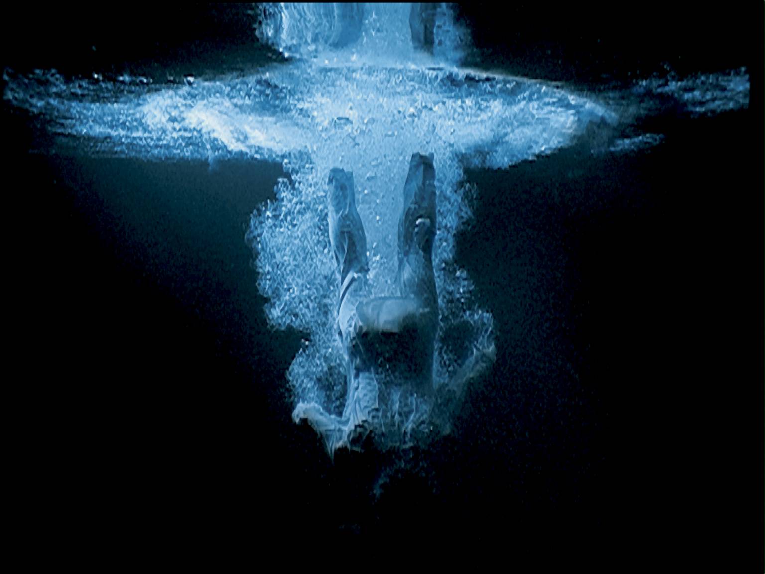
    Bill Viola, Five Angels for the Millennium 2001 


    Alongside installation, video is another format that Artists have increasingly explored in the last 25 years. Most contemporary Art galleries today have plenty of examples of this genre, both good and bad. One of the most skilful exponents of this medium is the American Bill Viola, whose slow motion pieces have a transcendental quality. Five Angels is a video work that is also an installation, as it comprises five large screens that are viewed simultaneously within a darkened space. In common with other works by Viola this piece refers to both religion (the ascending and falling angels) and personal memories (his near death experience as a child when he fell through ice on a frozen lake). The overall impression is extraordinary, the video format allows Viola to engage more of our senses in experiencing the piece, the haunting sounds of the gurgling, bubbling, splashing water perfectly complement the stunning visuals. It is a powerful note on which to conclude the show.